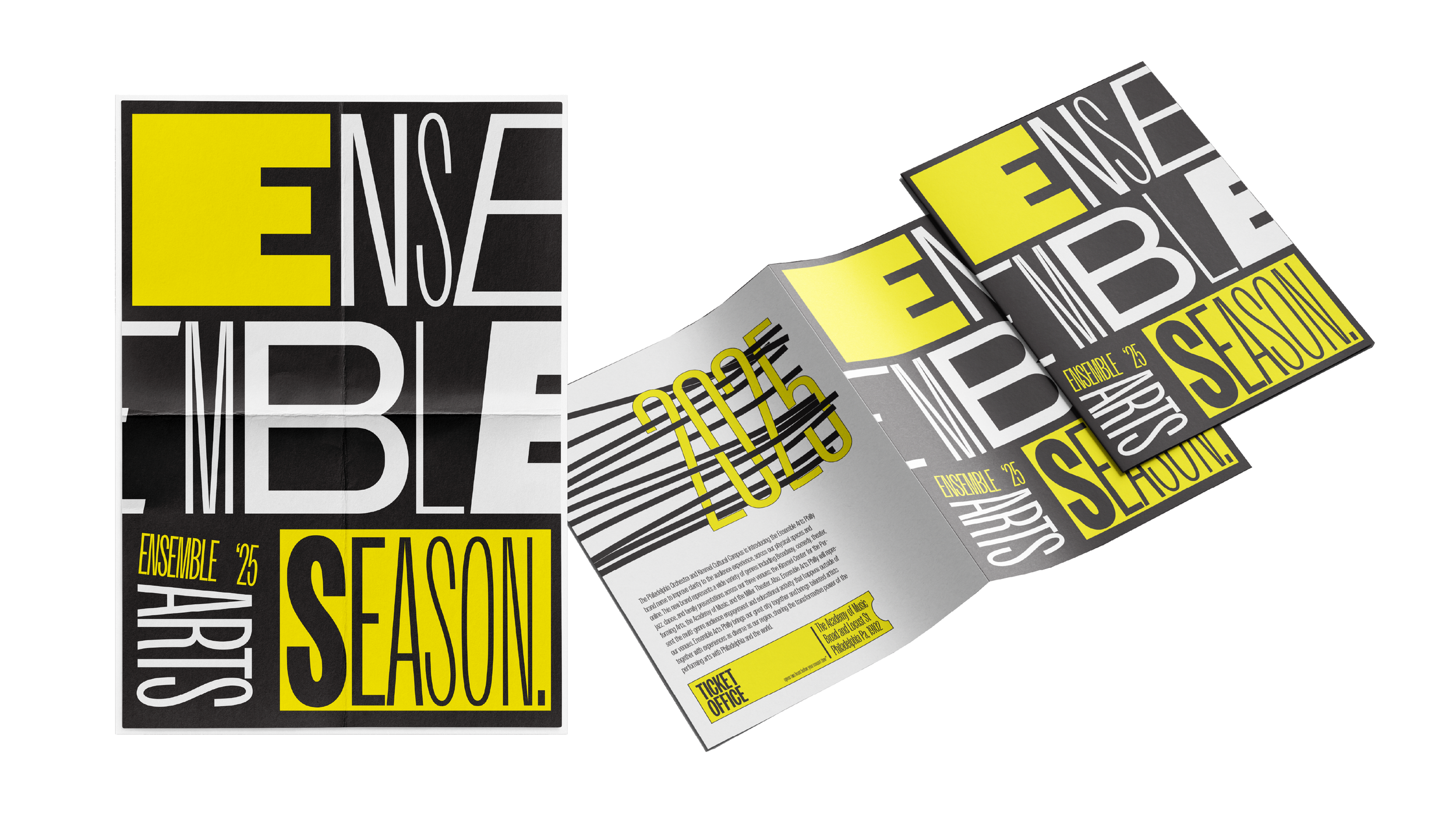
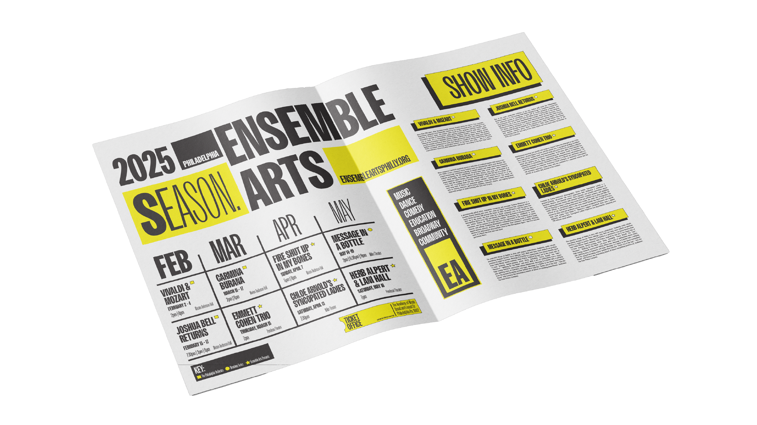
ENSEMBLE ARTS
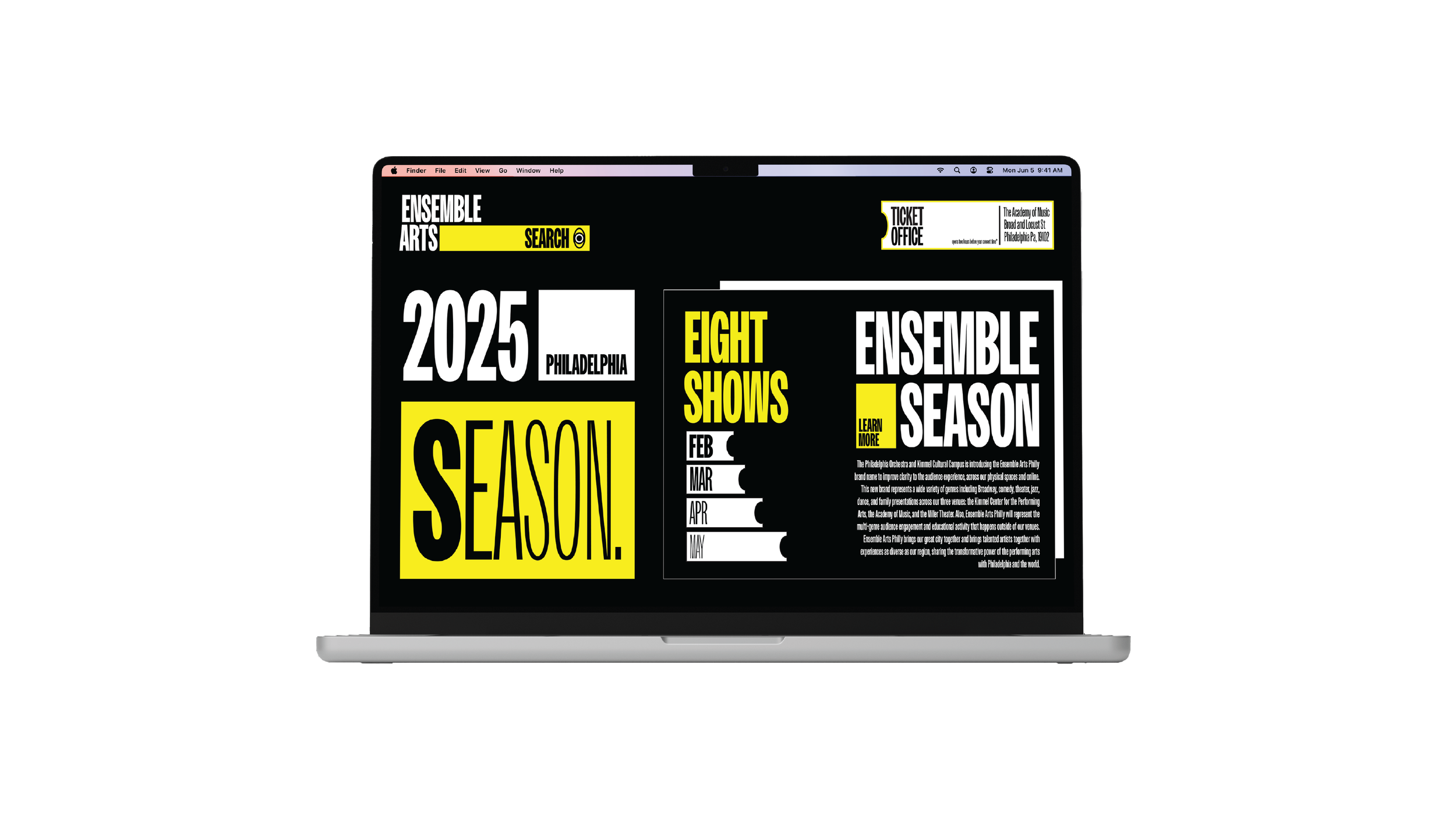
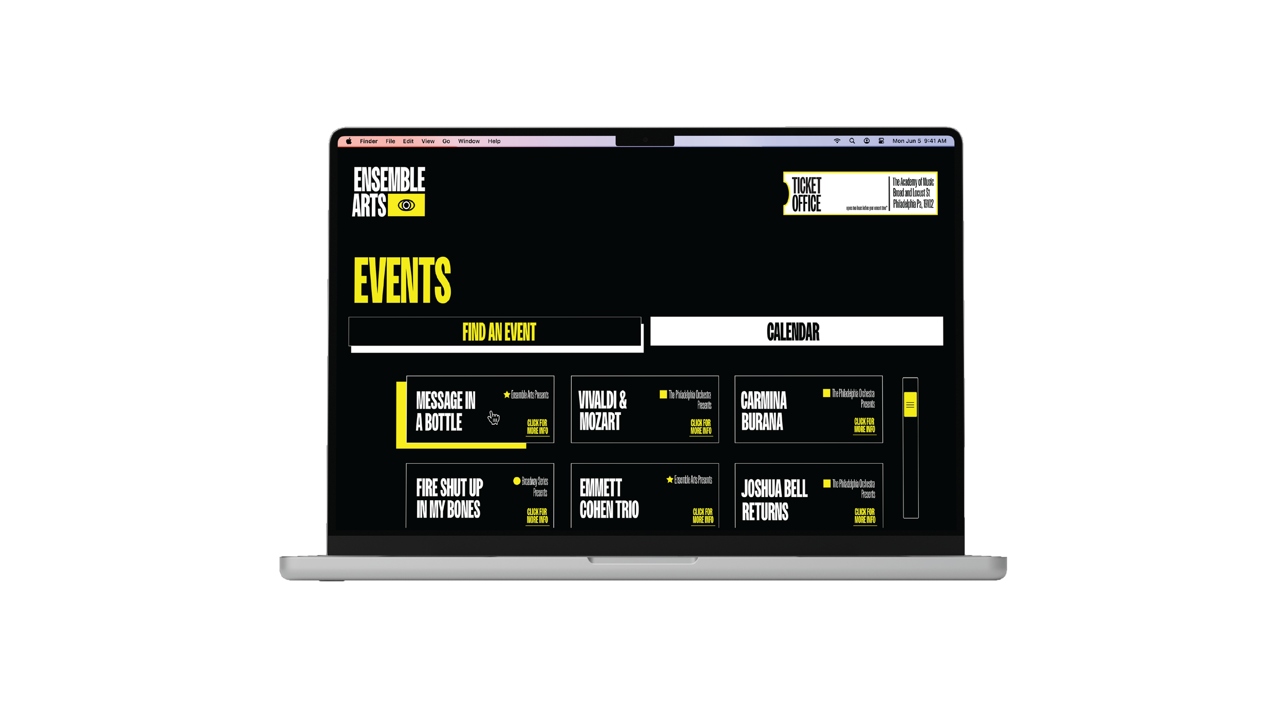
This seasonal campaign was full of range and it only made sense for the design to reflect that. Using typography and a focused color palette I was able to highlight the diversity within Ensemble Arts while keeping everything cohesive. Ephemera plays a big role in brand longevity, so the interior was kept clean and readable, allowing space to explore the season’s lineup in more depth. With such a wide mix of experiences, continuity matters. Small changes like syncing the website with print materials keep things fresh while staying grounded in the brand.